For all the WordCamps held in Manila so far–from the first WordCamp Philippines in 2008 until the recent WordCamp Manila 2017–the event logo has always taken inspiration from the Philippine Flag. We love this concept and that it represents how folks from all over the country came together at the WordCamps to talk about all things WordPress.

WordCamp Philippines 2008 
WordCamp Manila 2016 
WordCamp Manila 2017
But in the past two years, there have been WordPress meetups in several key cities in the Philippines, which means that WordCamps in the Philippines won’t only be in Manila. We’re excited to see this happen!
So for 2018, the team went for a design that showcases and celebrates Metro Manila, the sprawling metropolis that is the country’s capital. There was much brainstorming, discussions, design studies, and edits.
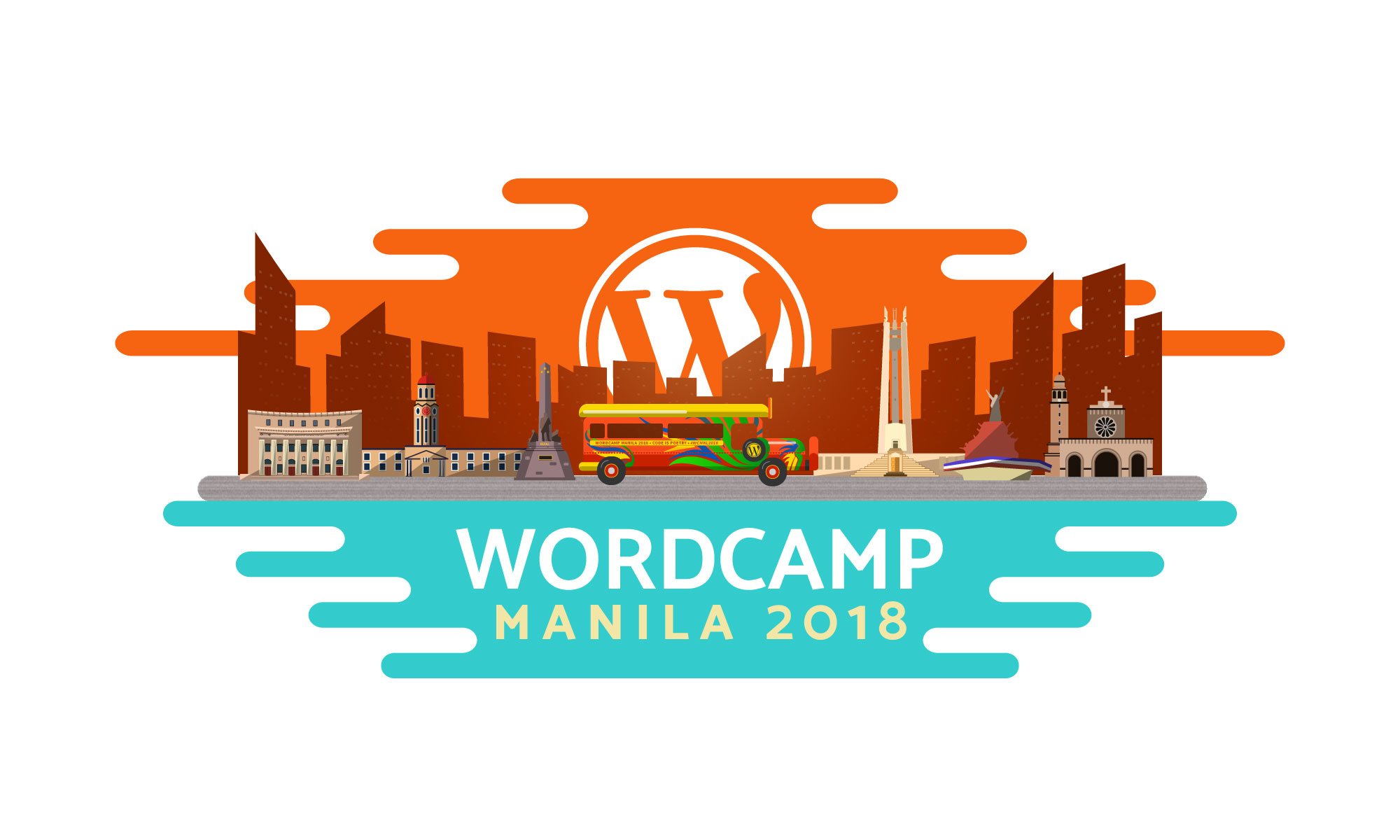
Designed by Ton Romero, intern from De La Salle-College of Saint Benilde; with our design team Arvin Pedregosa and Erwin Pagulong– we’re pleased to present the event logo of WordCamp Manila 2018!

This year’s logo features the iconic festive jeepney, driving through the bustling city and some of the many landmarks that tell stories of the metropolis–the Manila City Post Office, the Manila City Hall, the Rizal Monument, the Quezon City Circle, the People Power Monument, and the Manila Cathedral. The teal is a representation of the Manila Bay, the orange is the metropolis’ canvas of a sky, and the WordPress logo is–you guessed it–the sun in the horizon.
We’re super excited to see this in our event shirt and swag, which you’ll get if you have a WordCamp Manila 2018 ticket. Don’t have one yet? You can get yours at our tickets page!
